2.4 | Building blocks of a business intelligence solution
2.4.1 | Overview
In this chapter, I want to give a broad overview and a description of the building blocks of a business intelligence (BI) solution and how they are integrated with each other.
To make it less theoretical, I will give an example of how a certain element of the solution is implemented specifically with Power BI. However please note, all these components are relevant for any BI & analytics solution, independent of the specific software used.
The following illustration shall give a concise overview of how a business intelligence solution is typically structured:
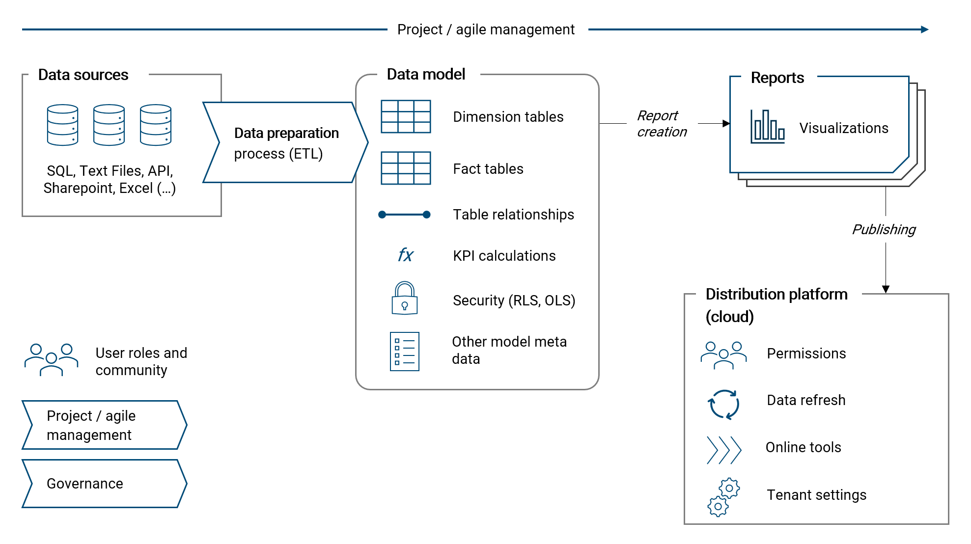
Please note, the important topic data quality management is discussed in a separate chapter at the end of the book, please see chapter VERWEIS.
2.4.2 | Purpose and goal of a BI solution
The purpose and goal of a BI solution is to answer analytical questions and to support and foster better decision making. For that, a BI tool turns data into useful information. Ultimately, the goal is to improve the competitive position of the organization. Both aspects - answering questions and making better decisions - can be applied on an operational an strategic level in a given organization.
On the strategic level, a BI solution supports the definition of strategic goals and measures. And of course, the success (and performance) of a strategy can be measured with respective KPIs in a BI tool.
Consider the following examples on the strategic level:
- Which of our business areas are growing and how profitable are they?
- In which business areas should we focus and invest?
- Which business areas need to be improved / fixed?
- How successful is our strategy in product innovation?
On a more operational level, a BI tool can support in day-to-day decision making and measure the achievement of operational goals with respective KPIs.
Consider the following examples on the operational level:
- Which customer should I focus on as a sales manager?
- For which product is inventory too high? For which too low?
- For which products do we see an upward trend in sales?
Of course, the distinction between the strategic and operational level is not clear-cut and both go hand in hand.
2.4.3 | Project and agile management
Designing and implementing a BI solution is a project and should be managed accordingly. How such a project is organized and executed in detail is specific to the given situation and framework of an organization. I will therefore not attempt to generalize it, however, I want to note down a few recommendations and guiding principles from my own practice which I know are strong instruments to increase the likelihood of the project being successful.
Given its importance, I first want to summarize my understanding and give an overview of agile project management. After that, I will list my recommendations on how to apply agile in the world of business intelligence and analytics.
Agile management
Agile has its roots in software development and it is today the standard method for IT project management. It is also becoming increasingly popular outside the IT realm, for example in finance or marketing management. Agile is so relevant today that it is a full-time profession for some people, with job titles like "Agile Coach" or "Scrum Master". I am not an agile expert, however I believe some of its principles and methods are highly valuable and as such apply them regularly in my practice.
In my own words, I like to explain agile as a concious effort to understand a project as a journey where learnings along the way are continuously incorporated into the process and the required solution is refined more and more over time. This method is very powerful and makes a lot of sense because in every project's beginning you have fairly little knowhow of how the final product should actually look like, function and be integrated in the existing organizational framework. Given that, the standard working mode in agile is to develop parts of the overall solution in an iterative approach with continuous feedback from the customer. The integrated sum of these iteratively developed small "packages" results then in the overall solution and product.
The following illustration summarizes important elements about agile that I want to mention here:
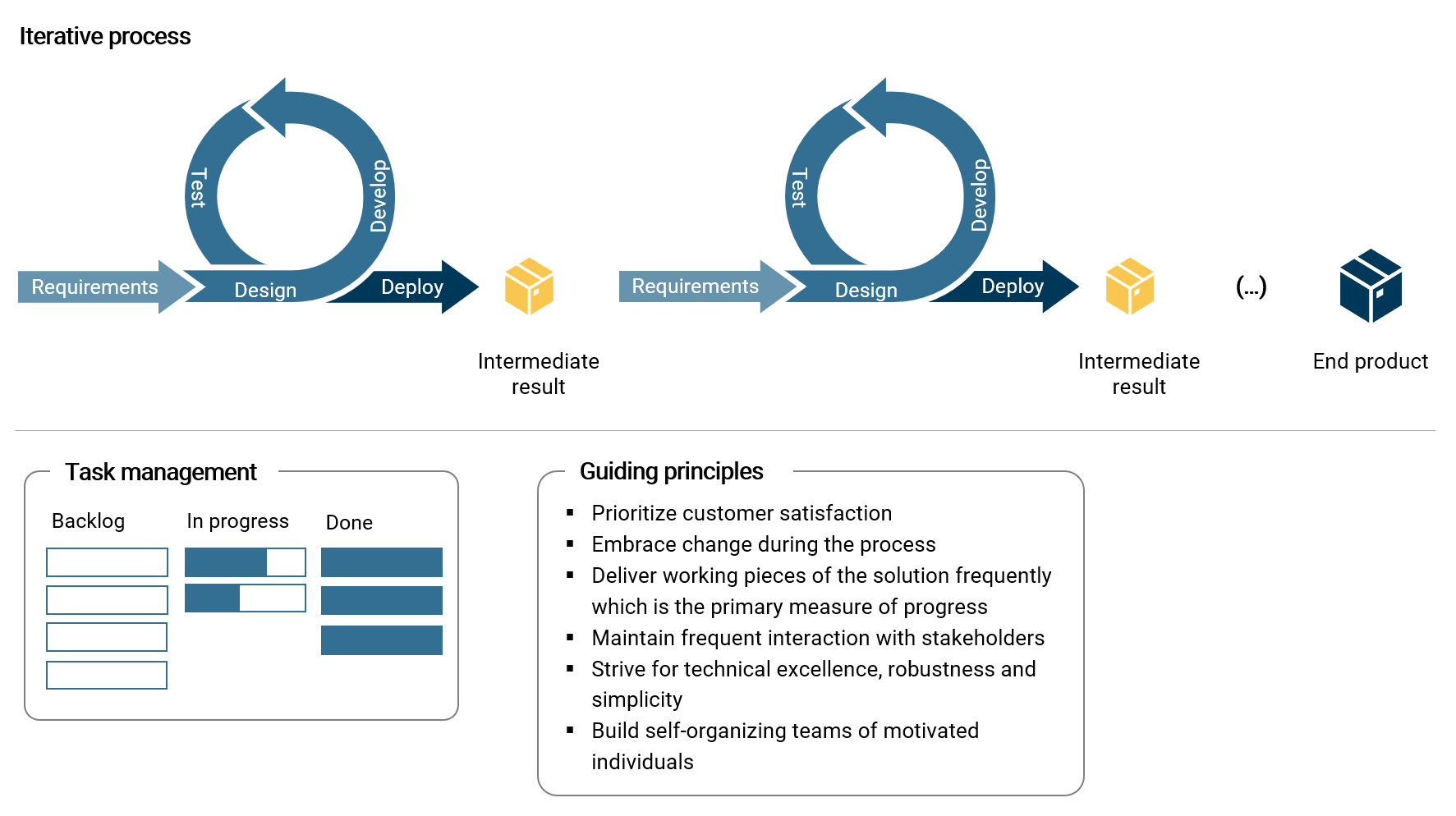
Besides the process of continuous delivery, I consider the effective management of tasks as crucial. One of the best methods in my experience is to use a simple Kanban board which structures tasks in the categories backlog, in progress and done. Such a board can quickly visualize the flow of work and progress in the current sprint. The backlog is the place to collect and prioritize requirements, ideas and other customer inputs.
The guiding principles noted in the illustration are derived (and summarized) from the agile manifesto. 1 Clearly, customer satisfaction about project deliveries is the ultimate goal and should never get out of focus. Therefore, frequent customer feedback is important. Further, I want to emphasize simplicity, which is the core principle for designing a robust operational business intelligence solution.
What is more, not only the project deliveries are continuously improved but also the agile project process itself with frequent reviews and retrospectives. And of course, teams, people and their roles are in the center of every project.
Recommendations for a business intelligence & analytics solution
- When defining the vision, goals and requirements of a solution, always start with the analytical questions that shall be answered with the new tool
- Based on the analytical question(s), derive required key performance indicators (KPI) (e.g. sales volume) and their dimensionality (e.g. by date, by product, by customer etc.)
- Given the KPI definitions, design the data model (on paper)
- Identify required data sources and derive the necessary data preparation process
- Start the project with a small, manageable scope (e.g. one KPI) and add more components over time (later, actively manage the scope at all times)
- Build a solid foundation of the solution (architecture, data model) before diving into visualization and reporting details
- Interact with the customer (incl. end-user) regularly, collect feedback and improve the solution accordingly
- Use a Kanban board to manage and visualize tasks and their progress
- Strive for simplicity and technical excellence as the core instruments to achieve operational robustness of the solution going forward
- Embrace uncertainty and change as an essential part of the overall journey. Developing a BI solution is not a linear process
- Do not get lost in agile project methodology (and bureaucracy): Use what is useful for your team and keep it simple and lean
2.4.4 | Data sources
Every business intelligence & analytics project has one or many data sources. A data source can be a source system, like for example an ERP or CRM system. It can also be a database like SQL, or text files (e.g. csv) and spreadsheets, or a web API.
For each project, the types and number of data sources used to extract required raw data is very specific. Therefore, there is not much that can be generalized about it. However, I want to touch upon two topics: data source connectors in Power BI and data architecture.
Data source connectors in Power BI
At the time of writing this text, Power BI allows to connect with over 130 different data sources. 2 These data source connectors are natively build into Power BI and as such regularly updated by Microsoft. Further, Microsoft has a track record of continuously adding more data source connectors over time.
With the following bullet points I want to note down important components and concepts regarding data connectors in Power BI:
- Data sources are connected (queried) with Power Query. Extracted data is then transformed, combined and imported to the Power BI data model
- Power BI can easily connect with different data sources at the same time and combine the extracted data to an integrated data model
- Besides the mechanism of importing data, it is also possible to use the DirectQuery method. 3 With DirectQuery, there is no data imported to the dataset and data is queried each time a user interacts with a report (e.g. changes the filtering settings).This mode brings quite a few limitations and should be applied conciously. In this book we will focus on the import mode which is far more relevant in practice than DirectQuery
- Power BI can read entire folders containing many files with the same structure which are then combined to a single data table. This can be highly useful in practice to quickly consolidate and aggregate for example budget data stored in many different spreadsheets (in the exact same table structure)
- Power BI can be connected directly with an operational source system (e.g. ERP) as the computational burden of the queries is fairly low and thus will - in general - not have an negative impact on the ERP's performance. Queries are only sent when a dataset is refreshed and data imported accordingly. In my practice of directly connecting dozens of ERP systems (without intermediate layer) I have not encountered a single problem ever
- When connecting with a SQL database, Power BI will attempt to push data transformation steps as much as possible to the data source in order to unburden data processing within Power Query. This mechanism is called Query Folding 4
- An important consideration is, whether a data source resides in an on-premise network (e.g. of the organization) or in a cloud network. In case of on-premise, the Power BI Gateway allows the Power BI Online Service (Microsoft 365 Cloud) to connect with the on-premise data source and refresh data in a given dataset 5
- With Power BI Dataflows, data sources are connected and data is extracted directly in the Power BI Online Service. 6 Dataflows can be a useful tool to prepare data tables which are used repeatedly in different datasets in a BI ecosystem
Data architecture: Data warehouses, data lakes, data lakehouses and the data mesh
Giving an overview of the components of a business intelligence solution would not be complete without a few words about data architecture. Therefore, I want to shortly discuss different variations of archicture which are currently relevant.
Please note, the topic of data architecture with implementation guidelines, in particular regarding concept of the data mesh, is discussed in much more detail in chapter 8.1.
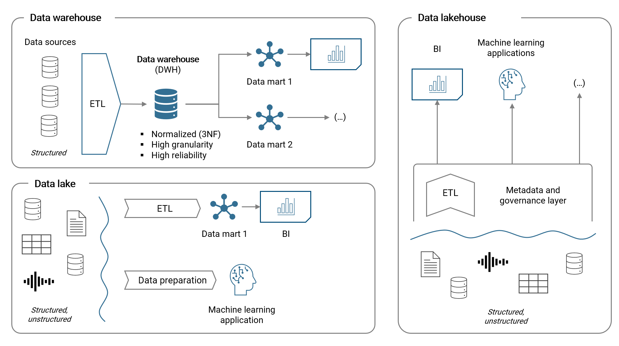
The data wahehouse (DWH) is an established method of storing structured data in a relational database. With an ETL process (extract, transform and load), data is prepared and loaded to the DWH. Subsequently, different datamarts are build upon the DWH with dimensional star models (we will discuss data models soon) which are then used as the base for BI applications and reporting. A DWH usually requires substantial investments and resources for the implementation, operation and change management.
With the emergence of big data (incl. unstructured data) and machine learning applications, the data lake architecture became more relevant. In a data lake, both structured and unstructured data (e.g. free text, audio, video etc.) is stored and unlike for the DWH, there is usually no or only little effort in keeping the lake tidy (from a central or governance perspective). Hence, costs are lower but so is reliability compared to the DWH.
The data lakehouse is a new concept which tries to combine the advantages of cheap data storage in a data lake with the reliability of a data warehouse. In essence, a meta data and governance layer (which includes ETL pipelines) provides the required structure to the data stored in the data lake. Data residing in the data lake is accessed by various applications via this structural layer.
The following illustration summarizes the key aspects of these architecture variations:
Relevance of a data warehouse today
To conclude this chapter, I want to shortly discuss a question, which I hear often:
Do I need a data warehouse for my business intelligence solution?
In general, having a data warehouse is certainly advantageous in order to have well structured and most probably reliable data available for analytics use-cases in the organization. However, implementing and operating a DWH will require substantial financial investments and resources. At the same time, many modern BI & analytics tools today are capable of covering the entire data analytics value chain due to their breadth of features. This is certainly the case for Microsoft Power BI, with for example dataflows or the new datamart feature next to the already very capable dataset technology. It is therefore only logical for many small and medium sized corporations to not operate a DWH (anymore) and instead use a modern BI platform.
A modern organizational approach to data architecture: The data mesh
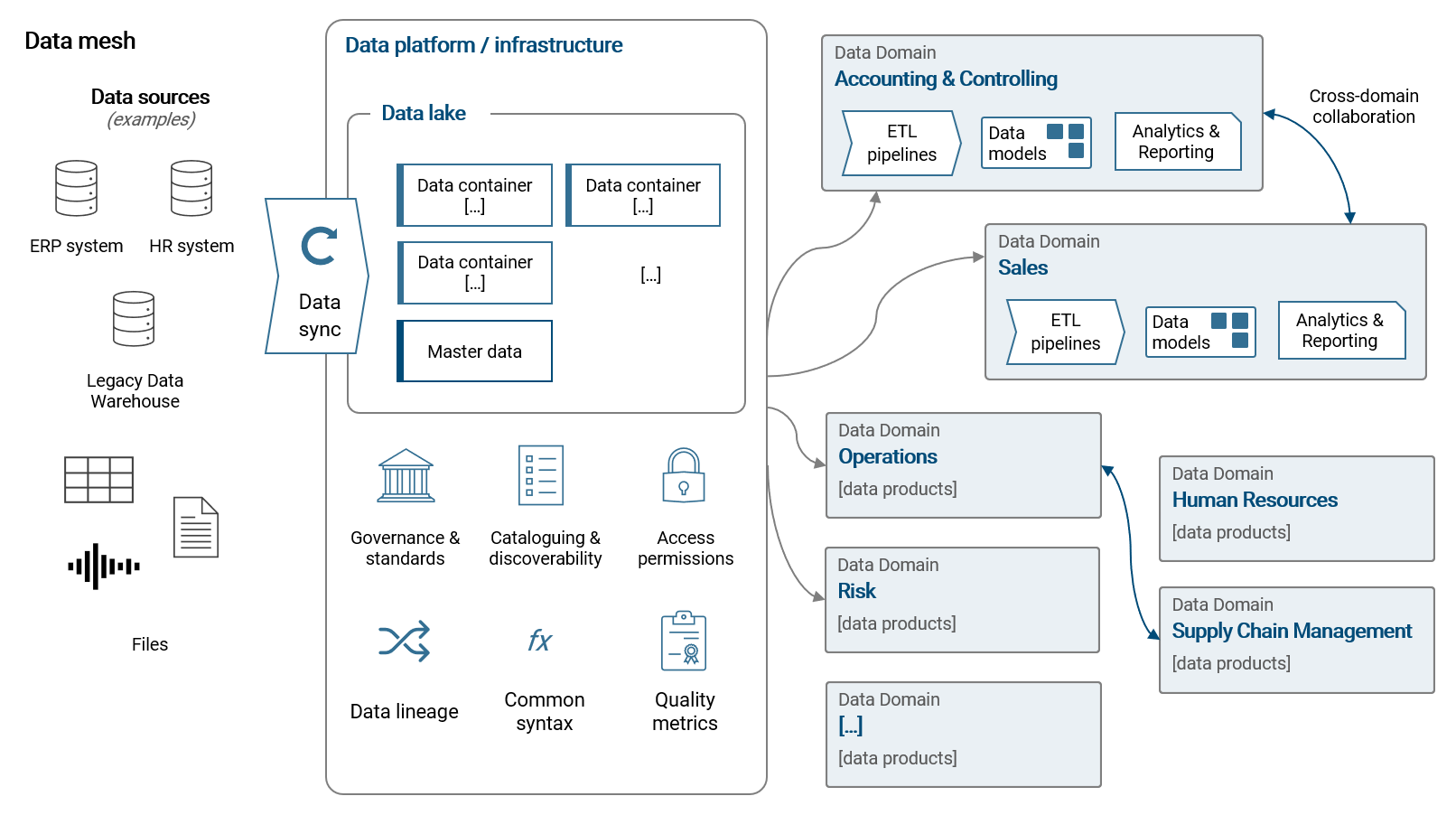
While the just introduced concepts look at data architecture from a technical viewpoint, I want to shortly introduce a modern organizational approach: the data mesh. We can define a data mesh as following:
— A data mesh decentralizes data management into data domains (= business teams) that fully own their data pipelines, models and data products. All data domains collaborate on a unified data platform that provides a common infrastructure for data storage, pipelining (ETL), analytics, standards and governance, access permissions and data discoverability.
Most importantly, the data mesh embraces the facts that (1) data requirements are specific to business domains and (2) modern data tools are highly self-service oriented. With a data mesh, we want to enable our organization to work more efficiently and effectively with data to support processes and decision making. We do so by providing a powerful, flexible and self-service orientiered data platform. Please note, in smaller scope use-cases, the data platform can be a modern BI tool alone (applicable to Power BI).
Please refer to chapter 8.1 for much more details and implementation guidelines for a modern and effective data architecture.
2.4.5 | Data preparation
Extracting, transforming and loading data from its source to the destination data model is an automated multi-step process and requires a powerful and flexible tool. A solid, automated data preparation process is important as raw data residing in a source system or database is only rarely in the structure required for the BI solution. Further, almost certainly the source data will need to be cleansed and data quality issues need to be addressed. And finally, often data from different sources shall be combined or raw data shall be enhanced with additional information (e.g. a mapping of categories) or calculated custom columns (mathematically or text based with if-then-else logic).
Each time the data in a given dataset is refreshed, the raw data from the source system has to run through the transformation process. It is therefore important to make the preparation process as efficient as possible in order to ensure that the regular data refreshes are fast and reliable. I further want to note, that in a best case scenario, most data processing should be done directly or as close to the source as possible. However, in corporate reality this if often hard to achieve because in such a setup changes are rather slowly implemented and more often than not source system are not capable of data transformation features.
Common data preparation steps
The following are the most commonly applied data transformation steps:
- Selection and renaming of columns (removal of columns not needed)
- Filtering (simple or by and/or logic)
- Data type definition (text values, decimal, integer etc.)
- Creation of calculated custom columns. Either containing string values (e.g. by merging text) or numerical values (by mathematical definition)
- Joins and unions of tables
- Agreggation of data rows via group by
- Pivoting (make columns from rows) and unpivoting (make rows from columns)
- Replacing values or errors in a column
- Data type transformations, e.g. transforming a date into its end-of-month equivalent
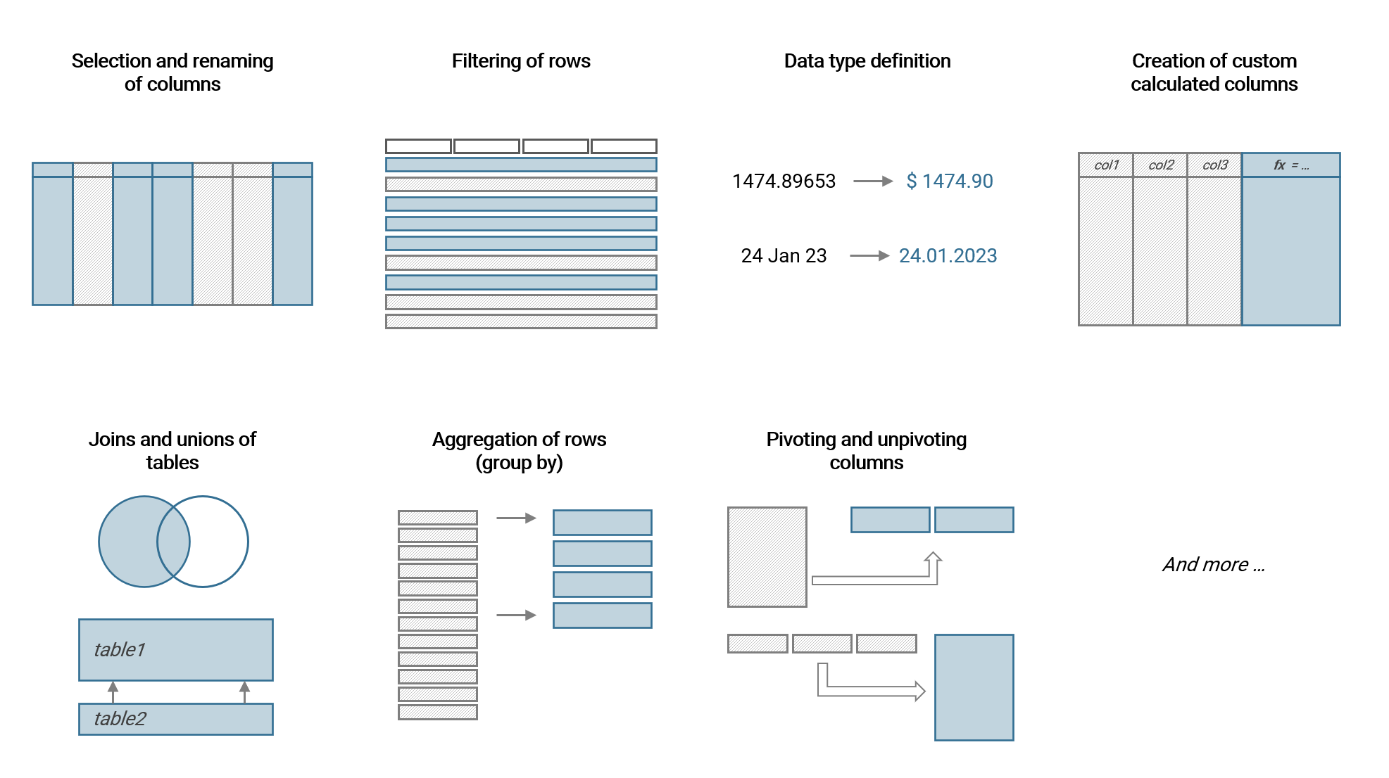
We will use the majority of these transformations in the upcoming example.
Data preparation with Power BI: Power Query
Power Query has been introducted in an earlier chapter. It is built into Power BI (and Excel) and allows the definition of data preparation processes which will then result in dimension and fact tables that are loaded to the data model (see next chapter). Power Query is very powerful while at the same time low-code and hence very accessible for non-IT professionals.
Power BI Dataflow
Dataflow is basically Power Query embedded directly into the Power BI Online Service. A flow is created, configured and run on the Power BI platform with the output being plain data tables (one or several per flow). These data tables can then be connected and used in Power BI Datasets.
Dataflows are highly useful to centrally prepare and manage tables which are used in several different Datasets, thus promoting reusability. This is often the case for master data tables (i.e. dimension tables).
Further, Dataflows can be useful to provide relevant tables to data analysts in the organization who have no access to underlying source systems. An important limitation to keep in mind about Dataflows is that access rights can only be controlled on workspace level.
2.4.6 | Data model
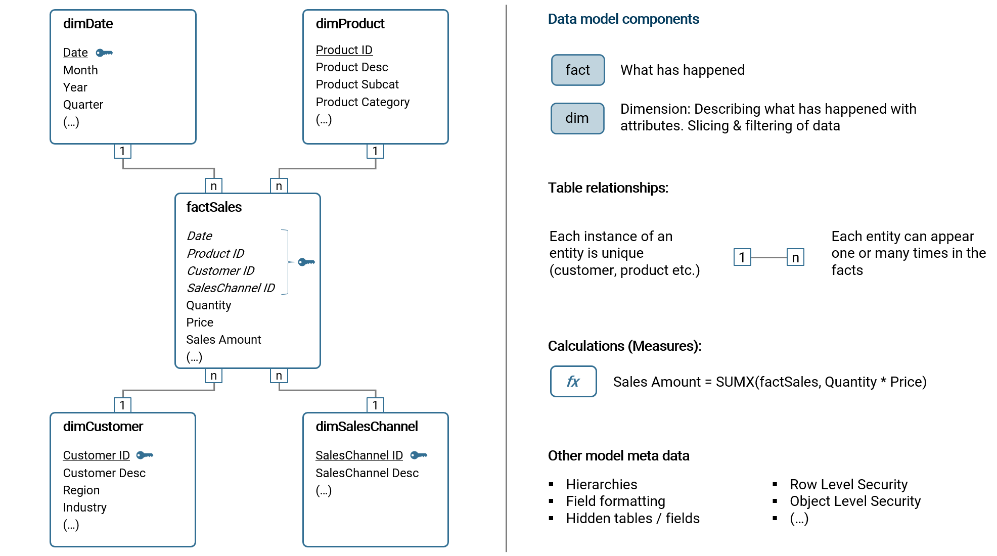
The data model is the core of each business intelligence tool. All visualizations, reports and KPIs are based on the data model. It is an abstraction of the reality we aim to explore with data. Dimension and fact tables and their relationships are the basis of the model. Other components like custom calculations or hierarchies are further relevant elements of the model meta data.
The most common data model schema for a BI solution by far is the star model. If you look at the illustration below, you will recognize a star-like formation of the dimension and fact tables. A variation of the star model is the snowflake model which further splits a dimension table (e.g. the field Category in dimProduct is outsourced to another dimension table, dimCategory which is connected with dimProduct). The focus of this book is the common star model as it is widely considered best practice. Other data model structures have a high chance of leading to a multitude of problems in the long term.
Please note, a star schema can have multiple fact tables. In that case, multiple fact tables share the same dimensions (e.g. dimDate) which is highly useful in the BI tool.
In the following subchapters, I will introduce the components of a data model.
Dimension tables
A dimension table essentially contains master data to describe what happened (in the fact data) with attributes. To make the concept more tangible, the following are common examples of dimension tables:
- Customer master data (customer ID, customer name, region, industry etc.)
- Product master data (product ID, product name, product description, subcategory, brand, type etc.)
- Countries and regions (country name, ISO code, continent, regional allocation etc.)
- Sales stores (store ID, store name, store location, store type etc.)
- Financial account structure (account ID, account name, account hierarchy level 1, hierarchy level 2 etc.)
- Cost and profit center structure (cost center ID, cost center name, cost center hierarchy level 1, hierarchy level 2 etc.)
- Employee master data (employee ID, employee name, birthday, cost center ID, entry date etc,)
- Date calendar (dates, month, year, quarter, calendar week etc.)
Essentially, a dimension table contains the master data which is relevant to analyze the fact data, i.e. to aggregate, slice and filter the data. Each dimension table has a key column, containing an unique identifier (ID) which allows to connect the table with the fact table. The attributes are the columns containing information relevant for the analysis, e.g. categorization, short and long names or even entire hierarchies.
Dimension data (master data) changes over time, e.g. the address of a customer or the category of a product. There are multiple methods to address this time dependency, usually with a concept referred to as Slowly Changing Dimensions (SCD). I will not go into detail here about SCD. But I want to note, that in my practice of implementing BI solutions, the most commonly applied method of SCD is Type 1: Overwrite. With this method, existing rows of master data are simply overwritten with the updated information. In business intelligence, this simple and robust method is commonly used as only rarely someone wants to analyze current data from the perspective of outdated master data (exceptions exist of course).
Fact tables
A fact table contains the data about what has happened when. Common examples of fact tables are:
- Sales (of product or services)
- Financial accounting bookings
- Inventory movements
- Clicks on a homepage
- Production line data
- Planning data (e.g. financial, production output etc.)
- Customer reviews
- Credit card transactions
Taking the example of sales, the fact table records sales transactions of products to customers by date. As you can see, we need three dimension tables (dimProduct, dimCustomer and dimDate) to analyze the sales transactions in this short example.
The important concept to understand about fact tables is that any dimensional data, i.e. attributes to describe the facts, should be stored outside the fact table in the dimension tables. In essence, a fact table only contains keys (usually IDs) with which it can be referred to a dimension table. In the example from before, factSales only contains the customer ID (and not other customer related information) and links to dimCustomer using this key column.
Table relationships
To build a data model, we need to connect dimension and fact tables with table relationships. Before we go into detail of how such relationships are defined, let's quickly clear the question: what is the purpose of a table relationship?
In the previous chapters, I explained how data is stored in dimension and fact tables and that we need the former to describe the latter. And describing means analyzing, and analyzing means: filtering, aggregating and slicing of fact data using dimension data.
Taking the filtering operation as an example, it means that in the BI tool I want to filter the dimension table, e.g. filtering dimCustomer by the attribute Industry in a dropdown selection and only fact data qualifying for this selection should be returned. Now for the BI tool to "know" that dimCustomer and factSales are related and that we want to filter factSales by the attribute Industry in dimCustomer, we need to define a relationship between the two tables - otherwise filtering dimCustomer has no effect on factSales. The same goes for aggregation and slicing: If there is no relationship, we cannot use dimCustomer to aggregate or slice factSales.
To discuss how a table relationship is technically defined, let's look at the following example:
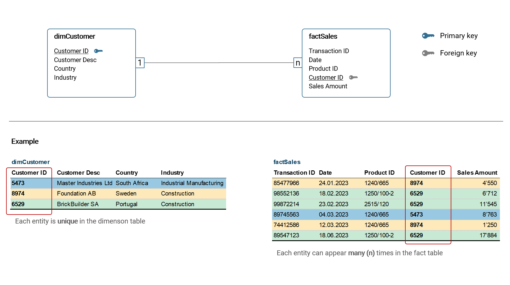
In the example above, the dimension table dimCustomer is connected with the fact table factSales via the Customer ID column. The cardinality of this relationship is 1:n, that means in dimCustomer, each entity (customer) is unique while in factSales a customer can appear n-times. This type of relationship is by far the most common and it is considered best practice to build a data model using only such relationships. There are other types of relationship cardinality like n:m, however they are only relevant in rare cases and should be avoided in star models as they can lead to unexpected results in calculations etc. Hence, I will not discuss them here further.
Tables are connected via key columns, commonly referred to primary key (in the dimension table) and foreign key (in the fact table).
Data modelling in Power BI
The data modelling tool in Power BI Desktop is accessed via the navigation pane on the left window border (see red frame below). Tables are then connected by simply dragging-and-dropping fields between tables.
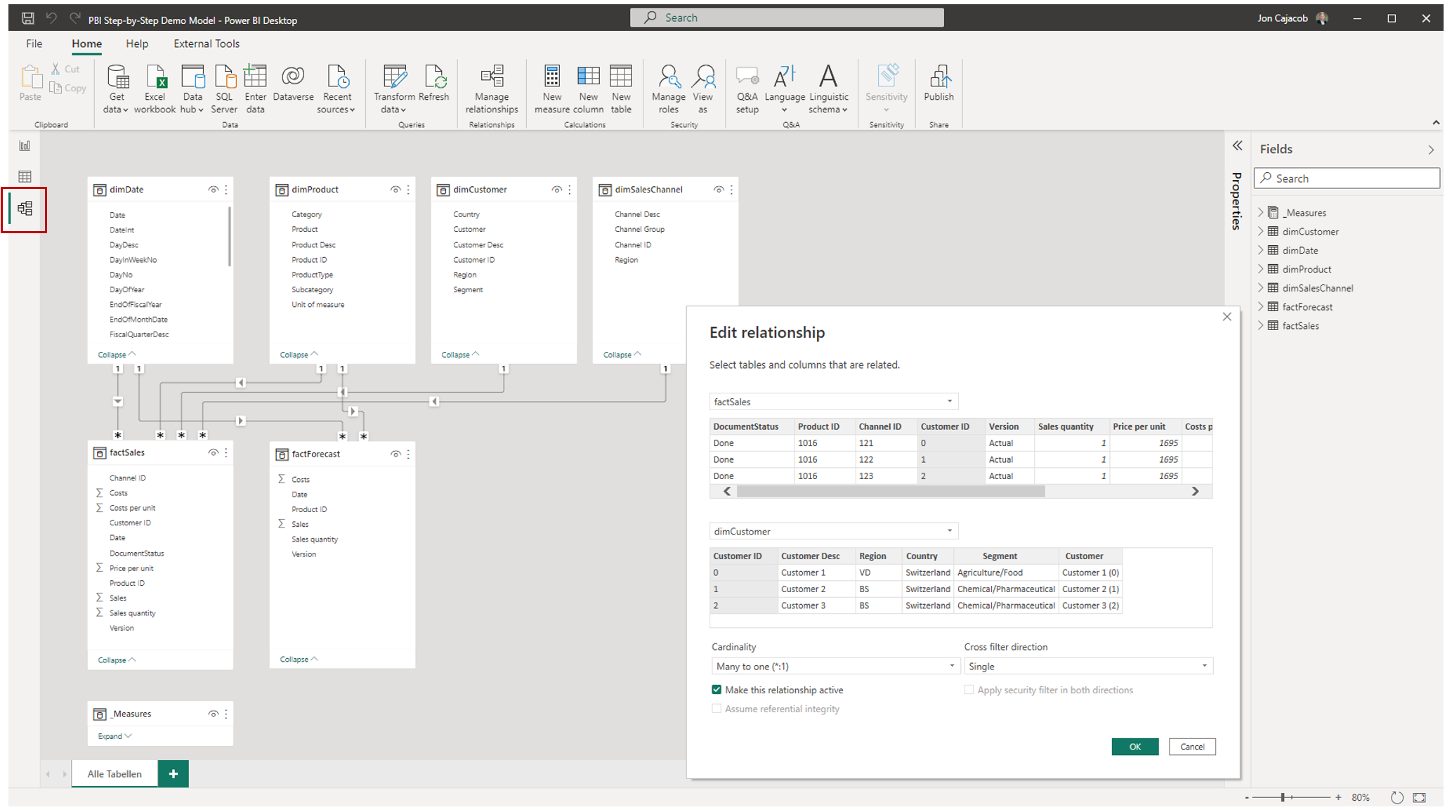
Each relationship has three main properties:
- Key fields (primary and foreign) by which the tables are connected
- Relationship cardinality
- Cross filter direction
With cross-filter direction we can control the filtering direction (single or both), illustrated by an arrow icon on the relationship line. It should be noted though, that it is best practice to only use single-filter directions (i.e. the dimension table filters the fact table), as otherwise unexpected results in visualizations etc. can occur.
Calculations (KPI, Measures)
The calculation and analysis of key performance indicators (KPI) is the main purpose of a business intelligence solution in the majority of use cases. In fact, practically all solution requirements can be derived from the analytical questions which shall be answered and decisions that shall be supported with the BI tool using KPIs as the guiding indicators.
I want to discuss two ways of implementing a KPI in a BI tool: Pre-calculated columns and dynamic calculations:
| Type | Calculated at … | Power BI |
|---|---|---|
| Pre-calculated columns | Dataset refresh | Custom column |
| Dynamic calculations | Runtime | Measure with DAX |
Pre-calculated columns are usually created as part of the data preparation process. Some tools (including Power BI) in addition allow to define such custom columns directly in the data model. In both cases, the calculation is static and only updated when the dataset is refreshed (i.e. the data preparation process is executed). It is important to note that pre-calculated columns are only applicable to calculations that are based on summation. A very common example is the pre-calculation of sales amounts based on the multiplication of price and quantity columns.
Dynamic calculations are dynamic because each time a user interacts with a visualization or dashboard, the calculation is (re-)run and the result is returned and visualized immediately. Common interactions are filtering, sorting or drilling. In Power BI, dynamic calculations are built with so called Measures using the functional language DAX. Within Measures, we can very precisely define the behaviour of a calculation in context of filters applied. Further, we can manipulate the filter context itself (e.g. total sales, but only for the region APAC). I will discuss filter context in the next chapter.
The following are some examples of Measures built with DAX in Power BI:
- Sales margin defined as (Sales - Costs) / Sales
- Sales volume of the prior year while the filter on the dashboard has selected the current year (using time intelligence functionality)
- Percentage deviation of sales quantity of the current month versus the prior month
- Employee turnover
- Average Co2 emission per dish sold in a restaurant chain
Row level security (RLS)
The row level security (RLS) is a security mechanism part of the data model metadata that limits the data rows a certain user can see when accessing visualizations and reports. Consider the following examples relevant in corporate practice:
- Country managers can only see financial data of their assigned country
- Cost and profit center managers can only see costs booked on their assigned cost center
- A sales manager can only see her assigned customer accounts
- Only corporate management can see the profit and loss statement of the company
- Only human resources managers can see employee data
The RLS can be implemented via rules and roles in Power BI. In the chapter of topic collections, I will go into more detail and provide an example (see here VERWEIS).
Besides RLS, there is the security mechanisms called object level security (OLS). With OLS, we can control which user can see which table column and full tables itself. Please note, this mechanism is rarely used with Power BI and it requires a separate external tool to establish respective rules.
Other important model meta data
The following are additional properties which are set in the data model:
- Descriptions of tables and fields
- Field formats (e.g. date format, number format with thousand separators and number of decimals etc.)
- Definition date table (for time intelligence functions)
- Definition of key fields
- Visibility of fields or entire tables
- Custom sorting of fields
- Hierarchies
- Standard aggregation method per field (sum, average, min / max, no aggregation etc.)
- Storage mode per table (import, DirectQuery etc.)
- etc.
We will touch upon many of these properties in the following chapters when building the data model.
2.4.7 | Data visualization & reporting
With data visualizations we present data in a way that is easy to read for the human mind. As with the overall purpose of a business intelligence solution, we visualize data because we want to answer analytical questions. When multiple visualizations are placed on a canvas, we usually speak either of a dashboard or a report (while a clear distinction between the two terms is not clear-cut and mostly useless).
One could easily write an entire book only about the data visualization component of a BI solution (and there is a good amount of books available). I will therefore only summarize the most important aspects here. In particular, I want to discuss visualization types, principles of good visualization design and filter context.
Visualization types and their application
There is a huge variety of different visualization types to present data. Only a few though are actually applicable in corporate reality, and I show these in the following illustration:
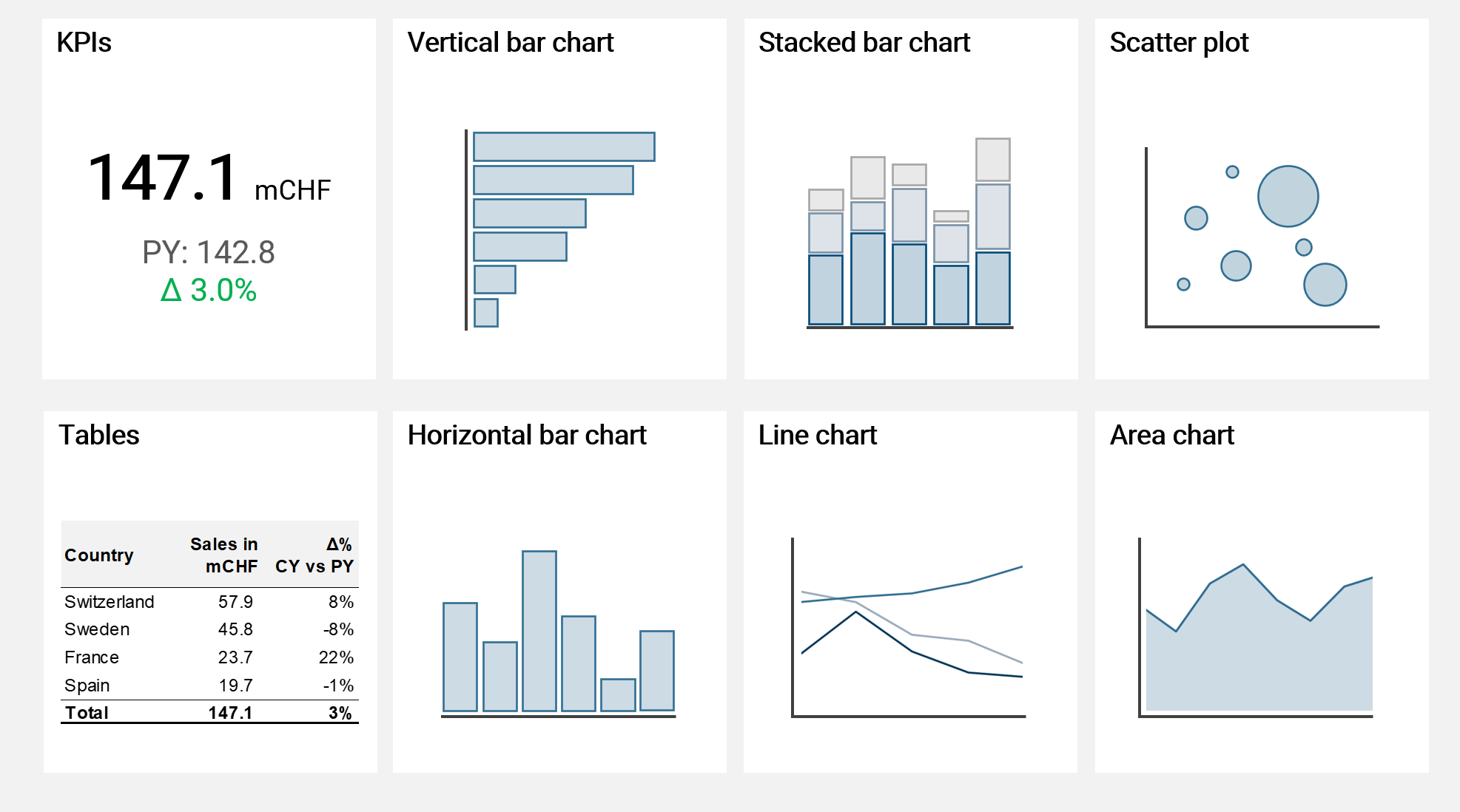
I can guarantee you, that for only very rare cases you would need another visualization type than the ones shown above in the context of business intelligence. These types of visualizations are rather simple and very intuitive to read for most humans and therefore to be preferred over all other types of (more complicated) visualizations.
Horizontal bar charts are useful to compare different categories. Charts where the x-axis is horizontal, like line or area charts are preferred to show trends over time. Stacked bar charts are useful to further split a bar into categories, however please note they are already harder to read for the human mind. Scatter plots with bubbles of different sizes are very powerful to compare multiple KPIs. And finally, tables are by far the most powerful visualization when used with drilldown functionality and enhanced with visual elements like colored variations or data bars. Though some would argue they do look not visually exciting enough (which is an aspect completely irrelevant for good visualization design).
I do not recommend using visualization types like pie charts, doughnut charts, tree charts or stacked area charts as for all of them the human mind has difficulties understanding and comparing visual sizes and areas. Simply use a bar chart instead, as it is rather easy for the human mind to compare bars of different lenght (and of equal width).
I want to note one exception of a visualization type which is very powerful but not shown in the recommendation above: waterfall charts. The problem with waterfall charts is that unfortunately modern BI tool are (still) not really capable of this type of visualization. Power BI for example can show waterfall charts but only in a very rudimentary way, which is usually not enough for practical applications.
Principles of good data visualization and reporting design
There are certain guiding principles based on which I design all my visuals and dashboards. I refrain from listing detailed and strict rules of what is "allowed" and what not as this is rarely useful in practice given specific framework conditions of each BI solution like software used or organizational guidelines. If we however follow certain basic principes, we have a high chance of delivering easy-to-read and easy-to-understand data visualizations that convey the message and story we want to tell the reader.
Clarity: The data is visualized in a clear and easy to understand way
Purpose and function: The data visualization serves a clear purpose, which is usually to answer an analytical question or to give more context to other visualizations presented on the same dashboard (see below)
Data-to-ink ratio: The data-to-ink ratio is a concept introduced by Edward Tufte in 1983 and it goes as follows:
A large share of ink on a graphic should present data-information, the ink changing as the data change. Data-ink is the non-erasable core of a graphic, the non-redundant ink arranged in response to variation in the numbers represented. 7
Basically, the concept tells us to not use or minimize ink to "print" things which are redundant or irrelevant for the data presented. The concept encourages minimalism when creating visualizations and reports.
Consistency: When different visual elements are placed on a canvas to create a dashboard, it is crucial that all these elements are consistent in their design, e.g. regarding colors used. Further, we should always work with clear labels and descriptions of what we are actually looking at. Which KPI, which currency, which time scale and so on. And these labels and descriptions should be consistent as well, i.e. use the same words to describe the same thing
Context: Don't just present a single, naked number. Rather, present it and put it into context in order to help the reader understand and judge the information. E.g. when presenting sales quantities of a certain product, show the same KPI for the previous year and the respective variation
Interactivity: Use and leverage the functionality that a modern BI tool offers. Use drilldown hierarchies, filtering options, sorting options or switches to change settings (e.g. switching between currencies). Allow the reader to explore the data. Static, lifeless visualizations and reports are a thing of the past
To demonstrate the usefulness of some of these principles, please look at the two following visuals. Which one do you prefer?
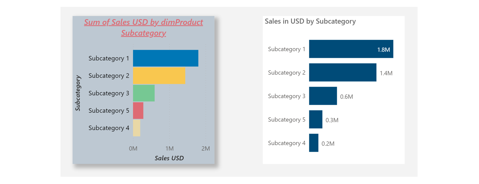
Both visuals show the same data. Clearly, the visual on the right presents the data in a more clear and clean way. Simply because we stripped away all redundant and unecessary components and visuals effects which are not relevant to present the core of the data. You may think this is all obvious but I can guarantee you that in today's corporate world, most of data visualizations lean more into the direction of the cluttered chart shown on the left.
For those interested in a more detailed guidance of good visualization and reporting practice, I can recommend the IBCS Standards (International Business Communication Standards). 8
Filter context
Before we close this chapter, we need to discuss filter context which is a key component of each data visualization and a very much underestimated concept.
The filter context describes all filters that affect a certain data visualization. This can be one filter or a whole list of different filters connected via 'and' / 'or' rules. A not well understood or wrongly set filter context is the main source of error and misinterpretation in a dashboard (closely followed by data quality issues).
In my own practice, I have gotten and seen hundreds of statements of users like this: "The dashboard shows the wrong data, please correct it." In about 9 of 10 such cases, either the user did not understand the filter context or the filter context was wrongly set by the user.
In Power BI, there are four ways to establish the filter context. All four of these components are connected with an 'and'-condition.
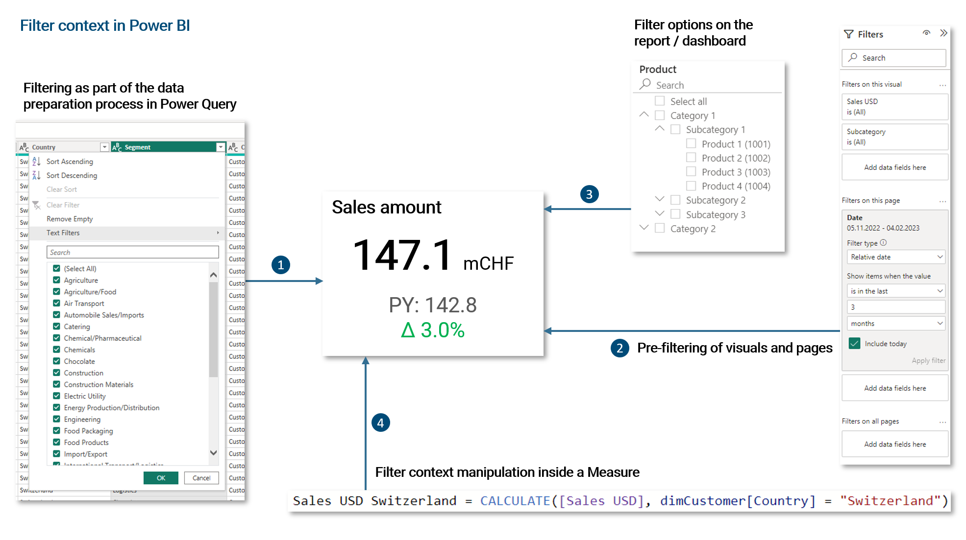
- Filtering of fact and dimension data as part of the ETL process. Usually, such filters establish the required scope of data for the business intelligence solution
- In Power BI, visuals, report pages and all pages together can be pre-filtered via a filter pane. This pre-filtering can be optionally locked and hidden from end-users
- Filter options that are available to the end-user on the dashboard. These can be single-select, multi-select, dropdowns, buttons etc.
- We can manipulate the filter context within a Measure. We can override, ignore or enhance filters established via the filter pane or filter options on the dashboard. As we will see later, this is a very powerful and important functionality
As already noted, all four of these filter mechanisms are connected via an 'and'-condition. For example, if we pre-filter the dimension Country to 'Switzerland' and 'USA' via the filter pane and then the user filters for 'Australia' on the dashboard via a dropdown, nothing will be returned. Given the same pre-filtering, if the user selects 'Switzerland', only fact data for Switzerland will be returned.
2.4.8 | Publishing & sharing
When the data model, visualizations and dashboards are prepared, we want to publish and share them within our organization. Modern BI tools usually come with a cloud platform solution that allows to host and distribute analytical content in an organization.
For Power BI, the usual working mode is to develop datasets and dashboards with Power BI Desktop on the local machine. Once a dataset is ready, it can be published to the cloud platform Power BI Online Service together with the associated report(s). On the platform, users in the organization can be granted access to the reports. They can also be granted access to the datasets if they want to create their own reports and dashboards which is often the case for power users (see further below for a discussion about typical user roles).
The Power BI Online Service is deeply integrated with many other services from the Microsoft 365 platform. It is for example very easy to embed a Power BI report to a Microsoft Teams channel.
Components of the Power BI Online Service
The Power BI Online platform can be accessed via PowerBI.com where you are asked to log in with your Microsoft 365 credentials. Please note, a Power BI tenant has to be in place for your organization.
As you are used to it by now, I want to summarize the different elements and features of the Power BI platform with the following illustration.
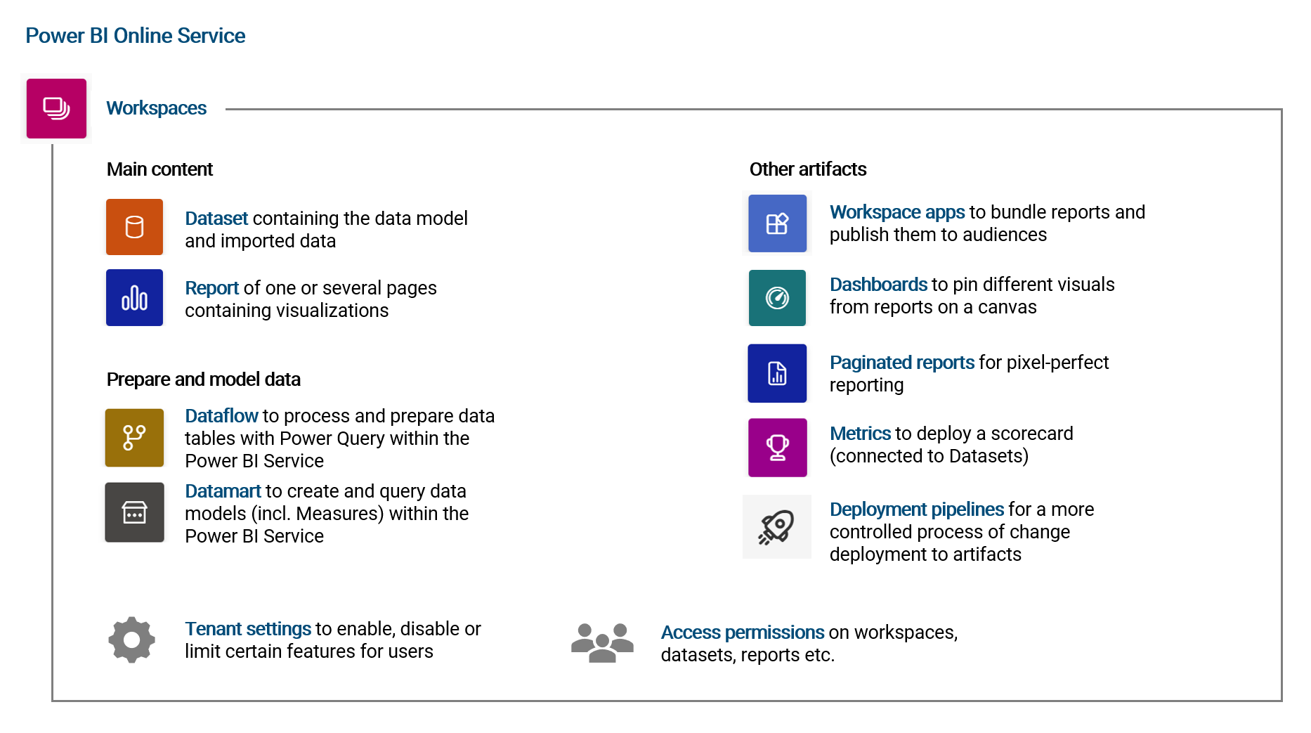
The most important concept to take away is that all content is organized in Workspaces for which user permissions can be set (see below). When publishing an updated version of a dataset and report to a workspace (where named dataset already exists), it is simply overwritten. For each dataset, an automated data refresh can be scheduled such that data in the dataset is updated at certain times of the day. If the respective data source is hosted on-premise, a Power BI Gateway is needed (see chapter VERWEIS for more details).
An important aspect to note about the Power BI Online Service is, that almost all analytical content can be created and edited directly on the platform via the browser. In particular changing visualizations and reports or preparing data with Power Query via Dataflows. The element Datamarts is a new feature that allows to create entire data models including Measures directly on the platform (it requires however a Power BI Premium license).
Generally speaking, the other components like Workspace App, Paginated Reports or Metrics are of less importance in practice (though of course there are use-cases and thus these features have a reason exist). I would argue that in 8 of 10 cases, Datasets, Reports and Dataflows are enough for a typical BI use-case.
User permission and data security settings
User access permissions are controlled on different levels in the Power BI Online Service. The following illustrates these levels and the different access roles:
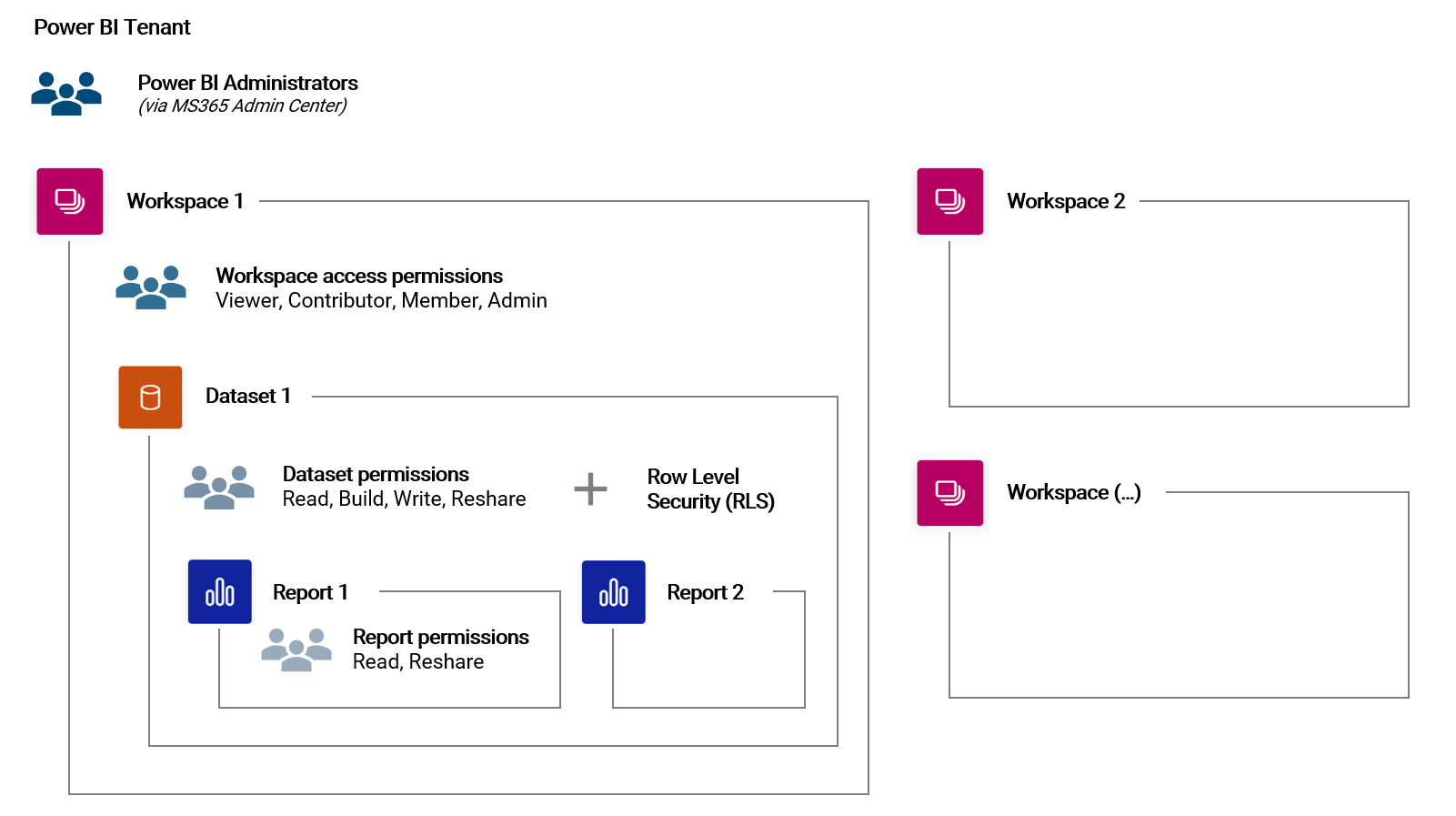
Access permissions are inherited down the hierarchy of objects. For example, a Workspace Member has automatically all permissions on a Dataset in that Workspace.
Note, in order to view a report or publish and edit content, a user needs at least a Power BI Pro license.
2.4.9 | User roles and community
The users and their experience with the BI solution are of the highest priority at all times. We can (roughly) generalize three types of users which will work with a given BI tool:
| Type of user | Number of people | Role description |
|---|---|---|
| End-user (also: business user) | High | Consumes existing analytical content (dashboards, reports, ad-hoc analysis etc.) |
| Power-user (also: developer) | Low | Develops and maintains analytical content (datasets, dataflows, reports etc.) |
| Administrator | Very low | Administers platform and users including licenses |
Clearly, this distinction is not always clear-cut as for example a user can be an end-user for one dataset while at the same time act as a developer for another dataset. Particularly in smaller organizations, a power-user is often times the administrator of the platform at the same time.
In large organizations with agile methodologies employed, there are commonly also the roles of the Product Manager and Product Owner. The former interacts with the customer / market while the latter focuses on the product backlog and development.
It is good practice to define the different roles that an analytics platform has as part of the overall governance model (who can do and is responsible for what).
2.4.10 | Governance
Data governance is not the focus of this book but it is an essential for every BI solution which itself is usually embedded in some kind of governance system specific to an organization.
In this short chapter, I want to list some of the important aspects of data governance. Please note, this is list is certainly not complete nor the only valid interpretation of what data governance is.
- Data policy: Rules and guidelines for the data lifecycle
- Data ownership: Who is responsible for what? Who protects data? Who manages and owns a dataset?
- Data architecture: How should the data architecture and its processes look like? What tools (software) can be used to work with data? How is data accessed? How is data stored (persisted)?
- Data management: Systems and processes (e.g. ETL) to manage the data lifecycle
- Data operations: Daily management of data in different systems (entry in transactional systems, storage in storage systems, reporting in analytics systems, usage in machine learning systems etc.)
- Data analytics: Answering analytical questions and supporting data-driven decision-making
- Data security & privacy: What are the rules and guidelines? Who is responsible for what?
- Data quality: Strategy, guidelines, processes, ownership
- Community: Cultural aspects of working with data (e.g. community meetings, knowledge sharing, best practice, hackathons etc.)
- Manifesto for Agile Software Development↩
- See here for the full list of currently supported data sources: Supported Data Sources↩
- DirectQuery Documentation↩
- Power Query Query Folding Documentation↩
- On-Premise Data Gateway Documentation↩
- Power BI Dataflow Documentation↩
- [The Visual Display of Quantitative Data, Edward Tufte, 1983]↩
- International Business Communication Standards (IBCS)↩