5.2 | Creating the first visualization
In this chapter, we will create a first simple visualization and explore different formatting options and ways to interact with a chart in Power BI.
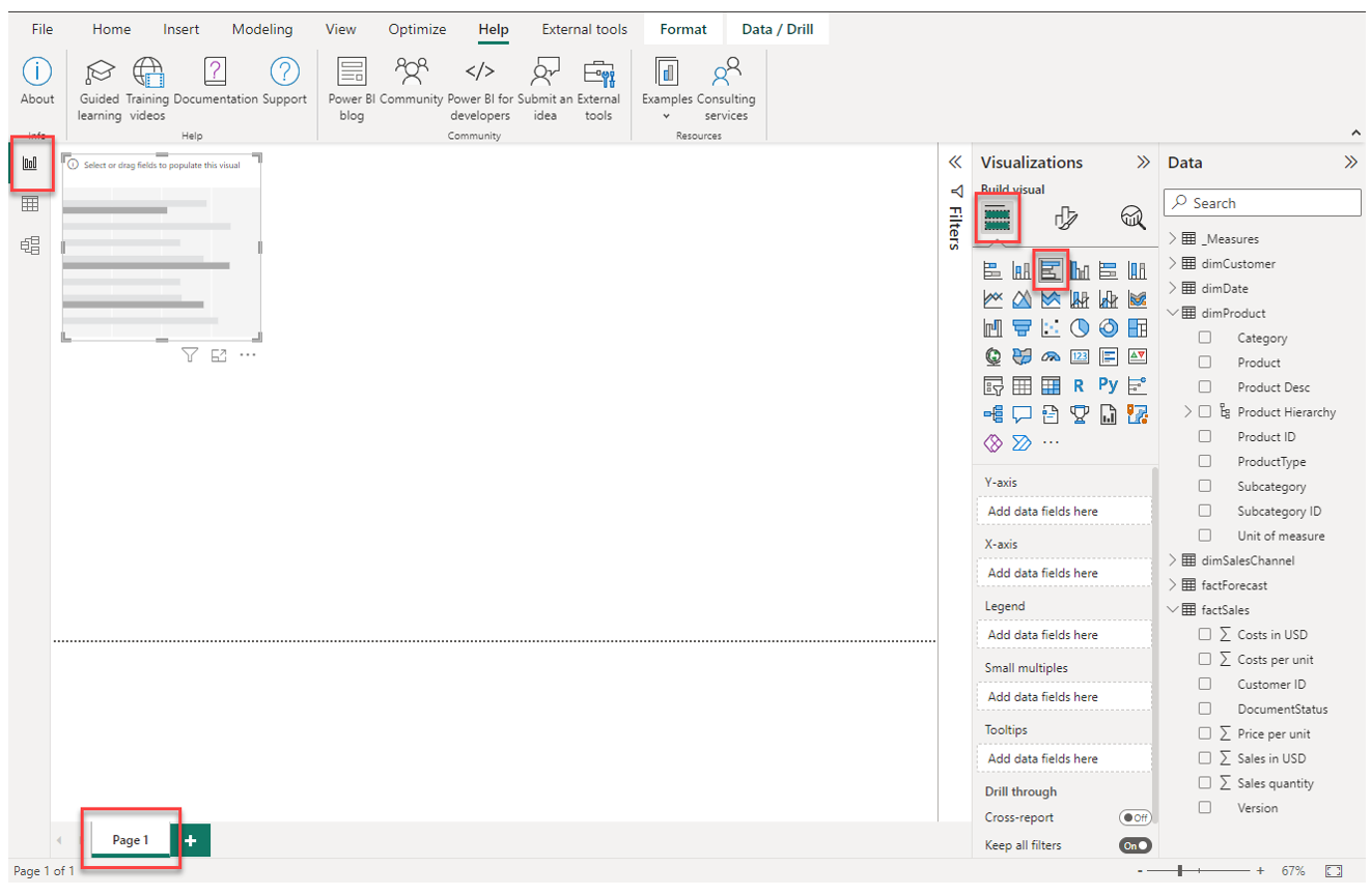
1. Place a new empty visual of the type Clustered bar chart on the report page
On an empty report page, simply click on the symbol for the Clustered bar chart to create a new empty visual of this type.
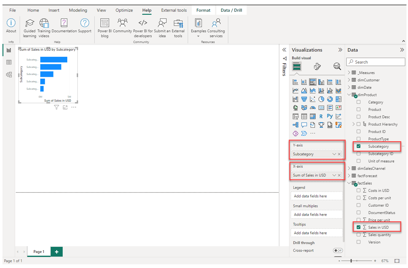
2. Populate the chart with the fields Sales in USD from factSales and Subcategory from dimProduct
Make sure you have selected the newly created visual (indicated by a thin grey bar around it). Then, place the field Sales in USD into X-axis and the field Subcategory into Y-axis.
You can do this by either just simply enable the checkmark left to the field label in the navigation pane or draging-and-droping the fields into the respective places.
3. Change the size and position of the chart on the report page
We can change the size and position of a visual element the same way as when working with Power Point. Use the markers on the thin grey border around the visual (when having it selected) to change its size. Use drag-and-drop with the left mouse-button to move the visual around and change its position.
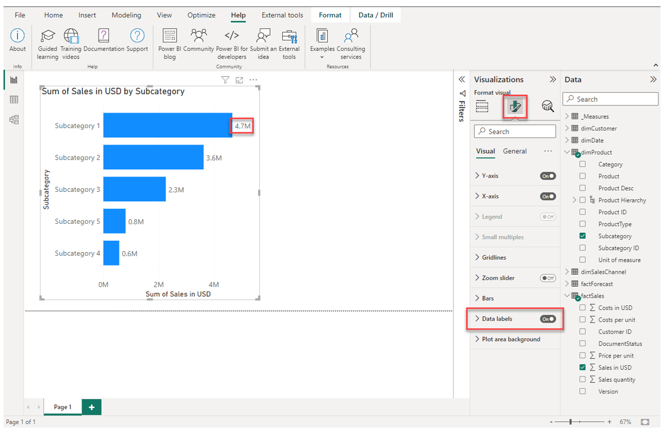
4. Navigate to the formatting options and enable the data labels
Now we would like to change some of the formatting options. Make sure you have selected the chart and then in the formatting options, enable Data labels.
Note that I also changed the font sizes so you can actually see something on the screenshot here.
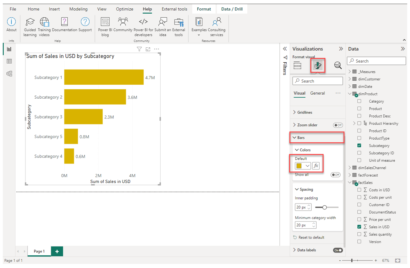
5. Change the color of the bars
To change the color of the data bars, expand the options under Bars and select another color.
6. Remove the X-axis and its title and the title of the Y-axis
Having the data labels enabled, we do not need the X-axis anymore. Also, we want to remove the title from the Y-axis.
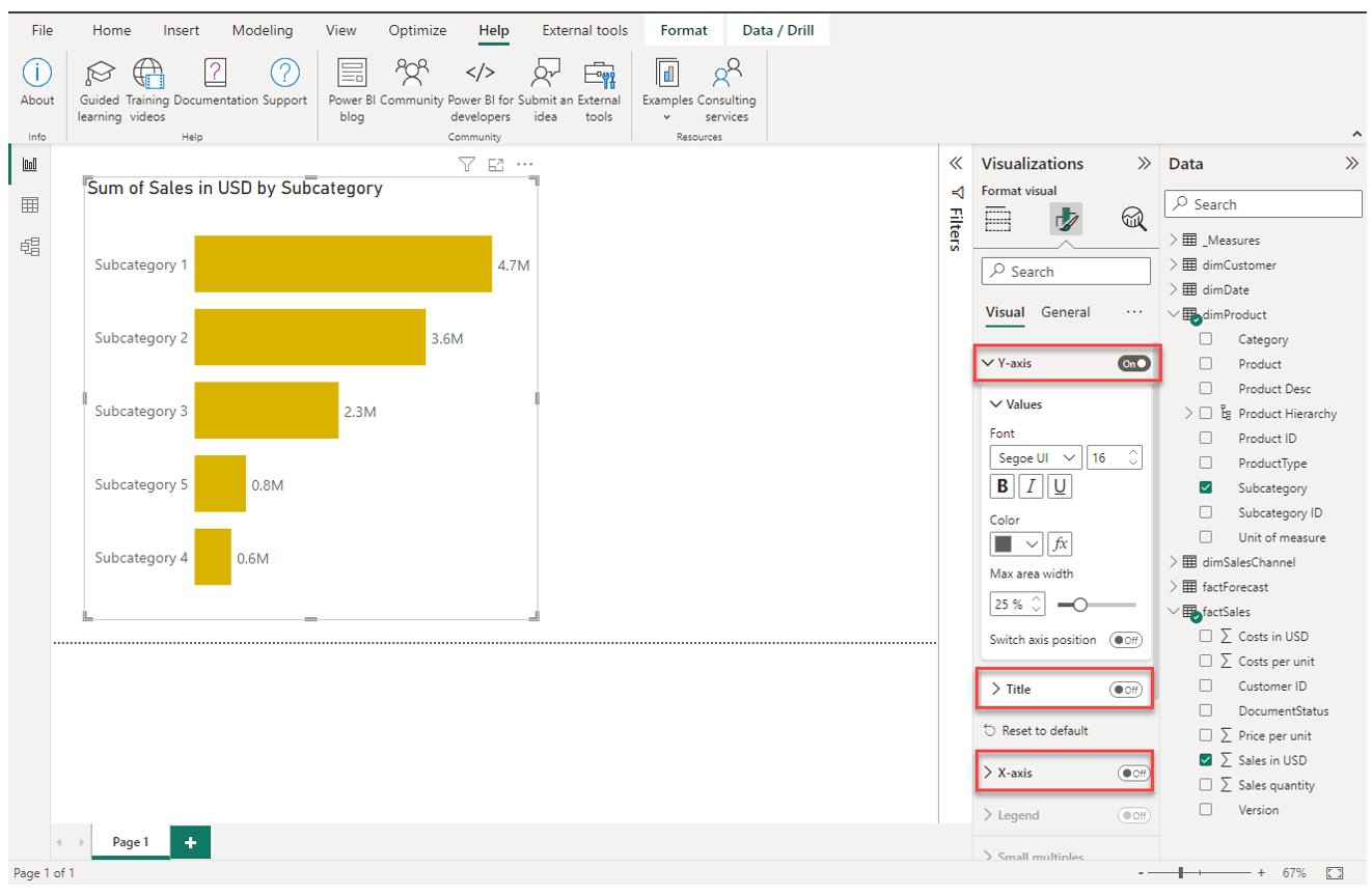
Note how the axis title setting is a separate option for each axis. Disabling the entire axis will not disable the title automatically.
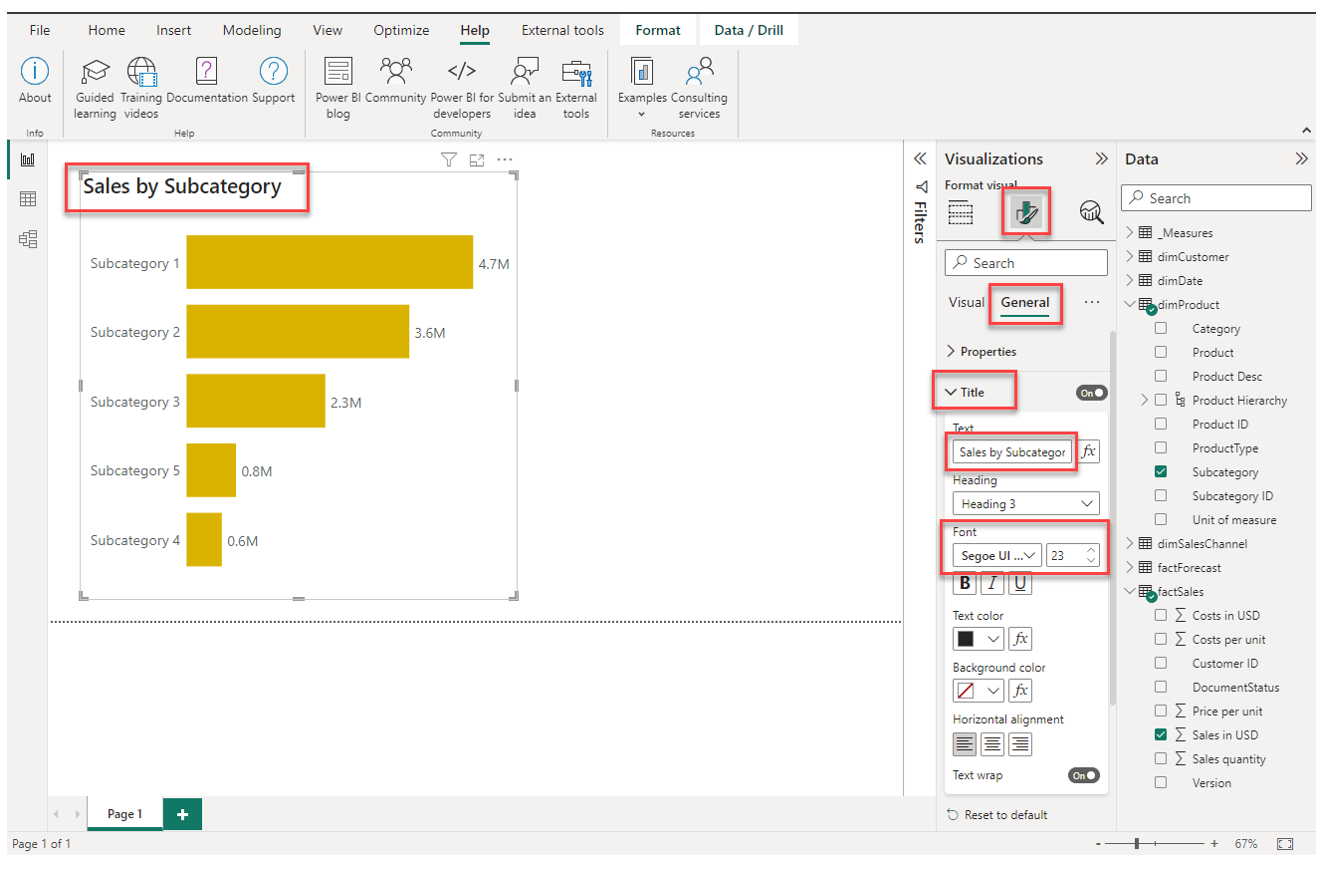
7. Change the title of the chart
To change and adjust the title of a visual element, navigate to General under the formatting options.
We have now created our first visualization and also adjusted it so that is adheres to good practice of visual design. In the next chapter, we will continue with this report page and introduce the usage of slicers.
8. Explore the different visual types and their formatting options by yourself
Describring all variations of formatting options and different chart types would not fit into a textbook so I encourage you to explore them by yourself. Here are some ideas to try:
- Try placing multiple fields on the Y-axis. With that, you can build a drill hierarchy
- Change the chart type while having the chart selected
- Try placing a field on Legend or Small multiples
- Click through and play around with the different formatting options available for different visuals