5.7 | Example of a fully functioning dashboard
Instead of showing the many available features to build a dashboard in Power BI step-by-step in this book, I believe it is more effective to provide a good example which you can explore for yourself. Therefore, in the solution file for the demo use-case of this book, you can find a fully functioning dashboard which I created using best practice and many different features of Power BI:
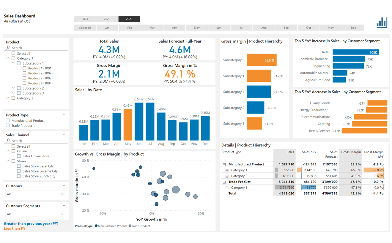
I want to highlight the following regarding this dashboard:
- The date filtering is on top of the page with a single-selection of the year and a multi-selection of the months
- All slicers are placed on the left border of the page. Some slicers are dropdowns (which can be configured in the formatting settings)
- All visualizations use the same color coding with blue showing an improvement over the previous year and orange for vice versa
- The card visuals with the big numbers always show a comparison value, mostly the previous year equivalent with a year-over-year percentage change. This gives the reader more context
- The bubble chart hosts 3 different KPIs in a very efficient form. Note how I used the field ProductType for the legend of the chart
- I also included a table visual. Note the visual enhancements with the data bars (configured under Cell elements in the formatting options). Because of these enhancements and plus the dynamic drill possibilities, a table visual is very often the superior choice for a report
- The dynamic coloring of a bar chart is configured under Columns in the formatting options with a simple rule that uses the year-over-year difference measure
- Finally, note how the measures are defined and how they are used in the different visuals. You will observe many of the techniques previously discussed and also how simple the DAX code used is - and yet how versatile and powerful this set of measures can be for a dashboard
You can download the full PBIX file here: File repository on GitHub